Kevin M. Keene
Racial and Social Equity in Assessments Part II — Conducting Meaningful Analysis
Understanding that the valuation process is producing undesirable bias is the first step in uncovering the cause(s) of observed bias. How can we actually determine the degree to which assessments are biased? Our way of proceeding should be with attitude of open-minded curiosity. Nothing in this process should come from a punitive or defensive mindset. We want to use analysis to uncover the root cause(s) of bias so remedial action can be recommended and taken, and we should be entirely objective throughout the process. If possible, a neutral third party should be used to run the analyses. One of the most insidious forms of bias is confirmation bias, which basically means that a person will see what they expect to see and will find data that supports their particular point of view and ignore all else. Using a neutral third party can avoid confirmation bias and is highly recommended.
Sales Ratio Studies
Ratio studies are commonly used to examine relationships between prices and assessed values. They are necessary and useful, but should not be exclusively relied upon. The vast majority of assessed properties have not been recently sold, so there is a presumption that the properties that have sold are indicative of the values of the large pool of unsold properties. This presumption must be tested. Traditional analysis relies on a sales ratio study that — for this purpose — is measured in terms of or overlaid against demographic data and exposes racial or social bias in assessments.
Assessment is, at best, an imprecise science. The goal of the Assessor is to produce values that are uniform and fair. Accuracy isn’t necessarily part of the bargain. (The title of IAAO’s publication is “Fair and Equitable” — not “Fair and Accurate”) The best models will be able to predict values within 10% of time adjusted prices between 70% and 90% of the time, which means they will be somewhat less accurate at least 10% to 30% of the time. It is easier to achieve higher degrees of accuracy and uniformity when the housing stock is more homogenous. In urban environments, housing stock is rarely homogenous, so higher degrees of variance in both price and value are expected.
When a property’s attributes at the time of sale are principally the same as at the time of valuation, there is a relationship between sale price and market value. When the attributes at time of sale and the attributes at time of valuation are significantly different, that relationship no longer holds true. The sale price may bear little or no relationship to the value. If we are using a ratio study as part of the equity analysis, these transactions must be identified and removed from consideration. This requires data files that allow the analyst to make this distinction.
Ratio statistics are usually measured for various stratifications of the sales file, including neighborhoods; property types, improvement size; quality of construction, condition of improvement, price or value categories, administrative units or any other attribute that is in the data. They typically indicate the level of assessment expressed as the mean, median and weighted mean market value to (time adjusted) price ratio, and measures of uniformity expressed as the average variance from the median ratio (COD) and vertical equity or regressivity (PRD or PRB). When sales ratios can be associated with aggregated demographic data, we can examine performance by income, race or any other category.
Representation
In most ratio studies, each transaction carries equal weight. This figure shows two different groups of comparable properties from the Philadelphia file. Groups are defined as properties that are from the same neighborhood; have the same design; were built in the same time period; are within the same size class; and are in the same condition. While there may be some variance in attributes within the groups, they are comparable in these major respects and share a reasonable basis for comparison.
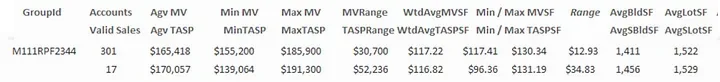
One group of 301 properties is represented by 17 sales.

The other group of 43 properties is represented by 22 sales. In an unweighted study, all 39 sales will carry equal weight, although each of the 17 sales for the first group clearly represent proportionately many more properties than each of the 22 sales for the second group. Having groups of properties that are persistent (exist in the data at all times) and consistent (are the same no matter who queries the data) allows for assigning of weights to each transaction that can better interpolate performance for unsold properties.
Many properties in disadvantaged communities or properties that are not “typical” are not represented by sales, which can easily lead to errors in valuation and/or analysis. One of the areas that I had to model in Philadelphia had a small number of properties that were in poor condition or vacant and abandoned. There were no sales of those properties, so we could not directly model an adjustment coefficient for them. Neither could we treat them as “average” condition properties. The point isn’t how we resolved the problem — only that we had to know that it existed and had to be addressed in some way.

This figure shows a group or 30 comparable properties that are not represented by any sales.
These properties would not be represented in a ratio study, so how could we know if the values were fair? We must go beyond examination of sales and consider the degree to which all properties are adequately represented in the analysis.
What are the minimal requirements for a qualified assessment equity study?
The data needed to support a meaningful study must include (at a minimum):
• A file of sales that have been validated and that contains significant attributes at time of sale. There should be enough transactions to allow for time trend development and adequate representation for all locations and attributes that contribute to value. This file is usually available only through the Assessor’s office. Some analysts will use a file from the local MLS, or other sites that publish real estate sales data. The problem with using that data is that it contains implicit bias for the properties that use brokers and against those that do not — many of which will be in disadvantaged communities.
• A file of all properties that are subject to analysis, including significant attributes as of the date of valuation. This file is usually available only through the Assessor’s office.
• A file of demographic data. This can be downloaded from the Census Bureau. For purposes of this discussion, I focused on racial and income data, although the census data contains many dimensions and categories. This data cannot be associated with specific parcels but is useful for creating aggregations that can be linked to parcels.
• Mapping results through a dashboard or a GIS visualization will require geocoded parcel and sales data and shape files for parcels, neighborhoods, and census units (Tracts or Census Block groups).
• Complete documentation of the valuation process, including the means by which values are estimated, and also for each of the subsystems that contribute to the process.
Demographic Data
Use of demographic data is necessary in a meaningful analysis of bias. This can pose problems if the assessment office conducts the analysis. Jurisdictions that are subject to the Uniform Standard of Professional Appraisal Practice (USPAP) are prohibited from using demographic data in appraisal, and the integration of property or sales data with demographic data is not recommended. One of the goals of refuting an allegation of bias should be to demonstrate that the valuation process is not influenced by demographics. This becomes much more difficult if demographic data is incorporated into the CAMA files. Once seen, it cannot be unseen. If it looks like it is being used in the valuation process, it is hard to prove that it is not. Primarily for this reason, it is recommended to use a neutral third party to run the bias analysis. The Assessment Office should furnish sales and attribute data but should leave the demographic analysis to someone else. None the less, it is useful to understand how such an analysis should be conducted.
Before using demographic data in an analysis, an appropriate unit of measurement must be chosen. Ideally, we should use the most granular unit available where there are enough observations to be significant. The number of units should be greater than the number of neighborhoods that are recognized so there can be variation within those neighborhoods. Zip codes and Census Tracts are typically too large to meet this requirement. Census Blocks are too small to generate meaningful aggregates and the demographics can change every time a family moves. Census Block Groups are a good choice.
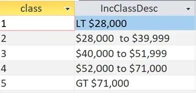
Taking raw census data as scalar or numerical values can generate results that are difficult to interpret. It is useful to transform the data into categories or “buckets” that are easier to interpret. One must also decide if it more appropriate to define strata by absolute or relative terms. Median income and cost of living vary greatly from one municipality to the next. Therefore, it makes more sense to look at median income from a local perspective. Using evenly distributed quintiles based on the median income for Philadelphia — where the cost of living is relatively low for a large municipality — normalizes the data to fit the local market. It makes more sense to examine racial composition from an absolute perspective, so the racial divisions will not be evenly distributed, but will conform to a more universal standard.
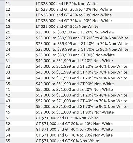
For the examples presented in this article, five “buckets” for income by Census Block Groups were created.
Using these break points, which are calibrated differently for each municiplity, results in an even distribution of Census Block Groups.
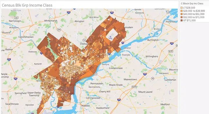
We can map the Census Block Groups shaded by income class:
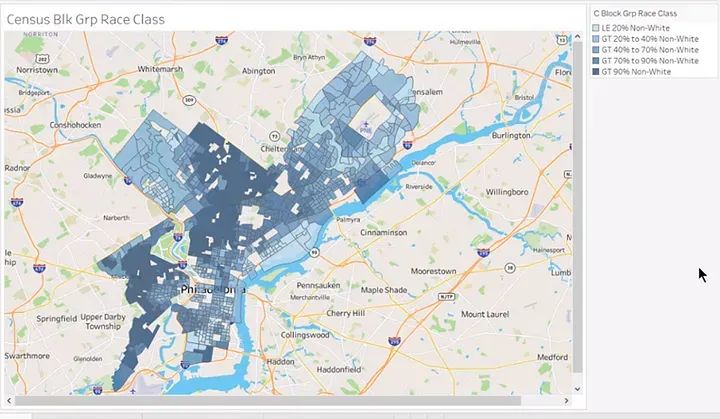
Five “buckets” were also created for racial composition and mapped the shaded Census Block Groups.
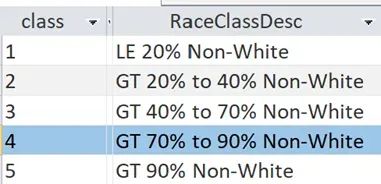
Using these break points across all municipalities results in an uneven distribution of Census Block Groups, but may provide a more significant look at racial mix or composition.
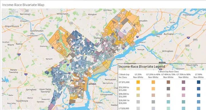
Combining each of five categories for race and income, twenty five “buckets” for every possible combination or race and income were created, ranging from high income/predominately white to low income/predominately non-white.
.webp?fit=outside&w=1600&h=1716)
Use of Visualization Tools
One of the best analysis tools available to us is the human eye. The eye/brain connection can expose patterns and simplify interpretation of complex data and relationships. Maps and charts can be assembled in interactive dashboards, static reports, or presentations that can show patterns of bias with relative ease.
.webp?fit=outside&w=1600&h=853)
This map shows clear patterns of racial and income distribution across Philadelphia
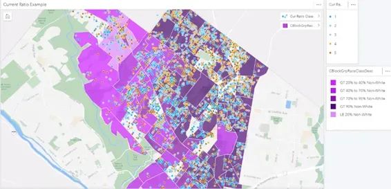
Mapping ratios from the sales file can reveal patterns of bias.
Example of no bias. There are high and low ratios, but the errors are randomly distributed.
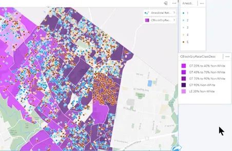
Example of anecdotal bias. Errors are concentrated in one area.
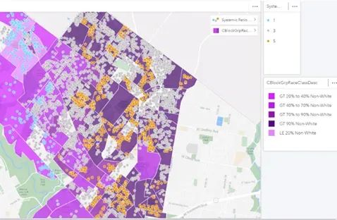
Example of systemic bias. High ratios are present in all communities of color and nowhere else.
By overlaying demographics with sale ratio distributions, we can see the difference between anecdotal bias, where high ratios are concentrated in one area, and systemic bias, where high ratios are uniformly present in all communities of color and absent in all others.
Getting Below the Surface Using Root Cause Analysis Tools
Maps and tabular data can show WHAT is present. If we want to correct bias, we have to understand WHY it is present. Interviewing persons that collect and manage the data to understand how they are making their decisions is a necessary part of the analysis. Many elements that effect the valuation process are prone to at least some degree of subjectivity. Are there written standards for applying codes, such as condition of improvements or quality of construction? Data gathering methods may be subject to wide degrees of variance and reliability. Many municipalities are limited to observations that can be “made from the curb”, and have very limited capacity to see inside of most structures. There may be photographs available for properties that sell or that file appeals, but a lot of assumptions are “in play” for unsold properties. When an element cannot be accurately or uniformly observed, what assumptions are being made?
Root cause analysis can help us understand the origins or sources of bias within a system. Using the same tool from different perspectives within the organization can identify the points of disconnection between the way that processes should run (or are expected to run) and the way they actually run. These are some commonly used root cause analysis tools.
The 5 Whys Method: Often considered to be the ultimate Root Cause tool, start by defining a problem, then ask ‘”Why is it happening?”, followed successively by “Why is that?”. Going five levels deep will usually expose the real cause of the problem. This technique works well in group settings where different perspectives are present.
Abstraction Ladders: Abstraction ladders promote thinking about a problem from its most basic concrete form to increasingly broad definitions and perspectives. In this process, we can determine where what should happen and what does happen diverge; to ask and answer “Where did we go wrong?”.
Stock and Flow models show how the parts of a system interact. They are used to identify a process’ inflows; actors and outflows. This tool can help us identify ‘What went wrong’ in a more systemic way than an abstraction ladder.
Rich Pictures are ways to explore, acknowledge and define a situation and express it through diagrams. It is a good way to think holistically about problem solving.
Current State Process Maps are similar to Rich Pictures, and are a way to create a snapshot of a process that can help identify shortfalls and friction points.
Much has been written about each of these methods, and I encourage learning more about them. Because bias is so deeply rooted in perceptions and processes, Root Cause analysis tools can be very helpful in identifying causes and solutions in ways that may elude “factual” or statistical analysis.
Recommend analyses
In summary, here is a recommended approach for running meaningful analysis that can uncover the degree to which bias exists and expose the sources and roots of any bias that is discovered.
• Run ratio statistics for properties in disadvantaged versus other communities. Tabular data can show if disadvantaged communities are assessed at different levels or less uniformly than other communities.
• Produce maps that show distribution of ratios in disadvantaged versus other communities. Maps of demographics overlaid with sales ratios can show patterns of bias.
• Produce maps that show the distribution of below average to poor condition or quality properties by demographic stratifications. Since the ability to maintain a property is a function of income, we would expect to see a greater proportion of below average to poor condition properties in lower income neighborhoods.
• Create maps that compare locations used in the valuation process to demographic groupings. Ideally, there will be little correlation between location groupings and demographics. This should be the case if property attributes are used to define locations. If census tracts or zip codes are used, there will be a high correlation of locations and demographics, since demographics are inherent in the locations.
• Examine the distribution of sale prices. Create categories based on either an even or bell-curved distribution. Use the same distributions to group market values (if you use fractional values or assessments, you will need to normalize the values). Categorize all sales and market values by these values. Compare sale price by category for each demographic class. Compare market value by category for each demographic class. Determine the percentage of properties that sold that where the price category is different than the value category. Map the results to see if there are patterns to the mismatches.
• Repeat the analysis above using sale price per square foot and market value per square foot instead total price or value. It may be useful to normalize the data by filtering for average condition properties.
• Identify properties or groups of properties that are not represented by sales and examine the market value per sf rates between represented and non-represented properties.
• Create maps to compare the distribution of rentals across community types.
• Review any available data definitions, process documents and training materials to determine the desired state of attribute data.
• Examine key attribute data to determine the degree of completeness, reliability, accuracy and consistency.
• Conduct Root Cause analyses from various perspectives within the organization to uncover sources of bias.
Statistical measurements and tabular data can help determine if bias exists. Visualizations can help us interpret the statistics to uncover both patterns and the extent of bias, and demonstrate the results in ways that are easy to understand. Root Cause analysis can help us identify sources of bias — both perceived and actual. Once we have conducted meaningful analyses, we are sufficiently informed and ready to move on to the real work — correction and remediation of any biases that have been identified.
About the Author
.webp?fit=outside&w=1600&h=1678)
Kevin Keene served the City of Philadelphia for over 30 years as a Real Property Evaluator; Mass Appraisal Analyst; Real Property Supervisor; GIS Manager; Modeling Director and Director of Mass Appraisal and Analysis. He personally designed and directed over sixteen major revaluation projects. He has trained appraisers, modelers and analysts and has been a frequent presenter at IAAO and URISA conferences.
In his semi-retirement he is the principal at Keene Mass Appraisal Consulting (keenemac.com), offering a variety of Mass Appraisal and educational services. His primary passions are promoting assessment equity, community activism and enjoying life with a loving wife and two adorable dogs.
267.307.6071
Kevin@keenemac.com